Design details of “Once a Year Occurrences in MLB”
For the project Once a Year Occurrences in MLB, I wanted to visualize baseball stats that tend to occur only once a year on average. I had a pretty clear vision for the high level design execution from early on, but as I built it out there were a few nuanced decisions that collectively really helped bring the whole thing home (ahem).
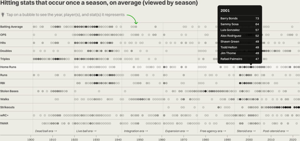
Tooltip positioning
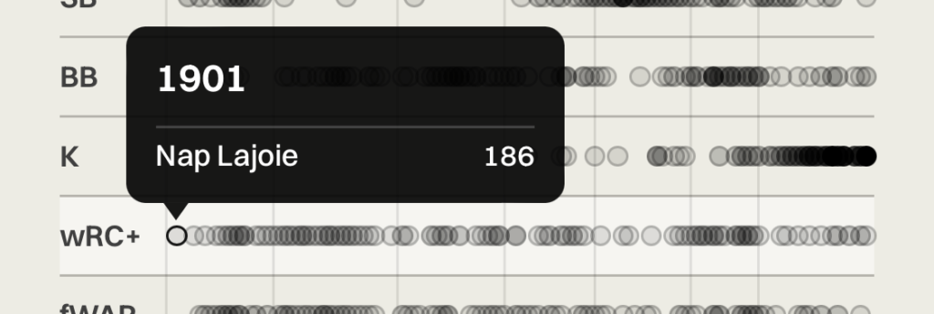
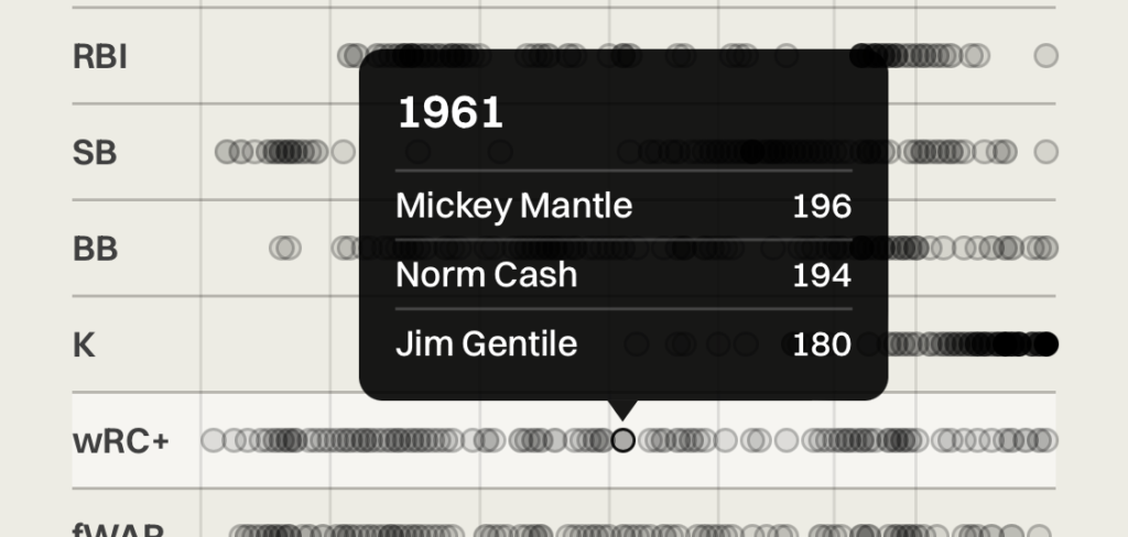
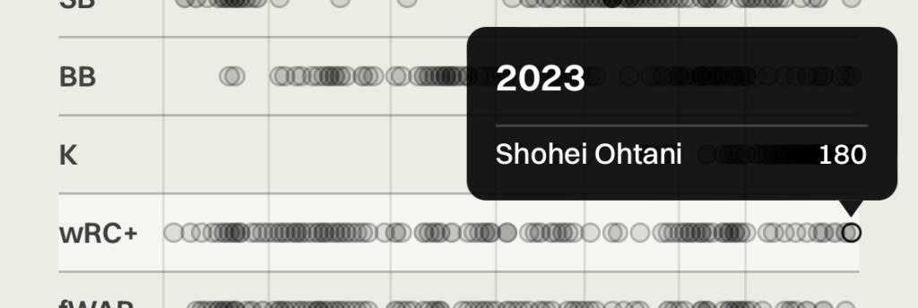
In the initial build, the tooltips that displayed above each dot were center aligned on the dot, with the tooltip pointer centered as well. This worked fine on larger devices, but when I tested on my phone, the tooltips on the far left and right edges of the chart were cut off by the edge of the viewport. Since it was happening on both sides, I couldn’t just universally change the alignment of the tooltips to be right or left justified.
I needed something more dynamic, but I didn’t want to have to use JavaScript to detect viewport edges and position the tooltip on the fly. Even though I could probably find something fairly plug-and-play to do that, I wanted the UI to be more consistent and predictable when hovering over many tightly grouped dots successively.
What if I could align the tooltip and pointer relative to where the dot was on the chart? Then I could guarantee the tooltip would always be in the viewport. Since I already had a function positioning the dot on the chart for each row of stats, I piggybacked off of that percentage-based value to write a statement that positioned the tooltip relative to it’s dot. Tooltips on the far left would be left aligned, tooltips on the far right would be right aligned, and it would progressively scale at each point along the way.
Eras display on small breakpoints
On my first pass at the mobile layout, I just hid the vertical lines and labels that marked the eras on the season-based charts. I figured there was no reasonable way to display 7 labels horizontally on a narrow viewport.
But it kept nagging at me — it was a critical element in telling the story of how certain stats were clustered in eras, and I hate making mobile readers get a second-class experiences unless absolutely necessary. What if I rotated the labels 90 degrees?
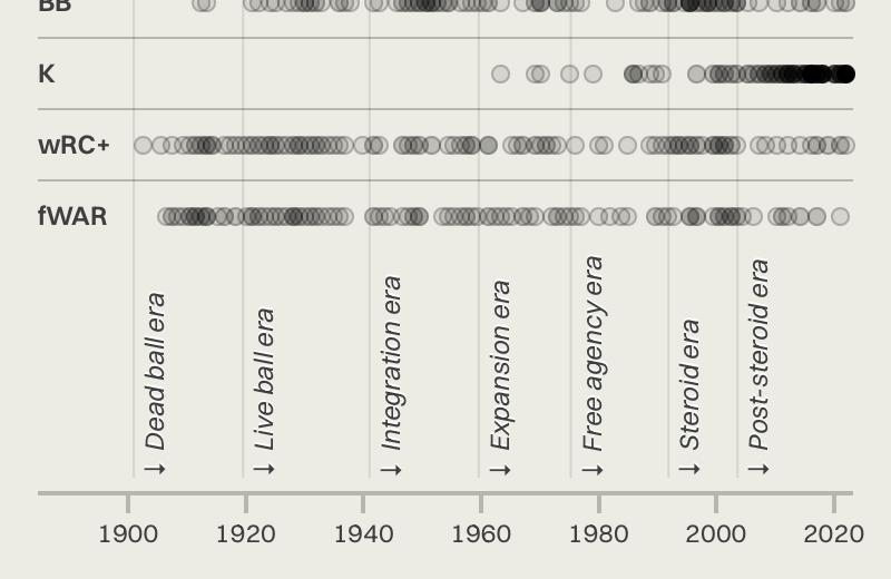
I didn’t love stretching the height of the bottom of the chart so much — I think it looks a little awkward — but it was worth it to add the context of the eras.
Showing min and max values for the stat-oriented charts
Showing the min and max values for each stat directly on the chart answers my original question — “what’s the standard for a great season?” — at a glance.

Abbreviating stat categories on small breakpoints
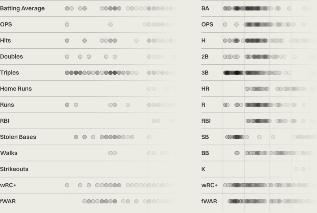
Another thing that was bothering me about the mobile layout was that some of the labels for the stat categories were taking up a decent amount of width, constraining the amount of space available to display the stat dots. To cut down the width, I figured it was a fair compromise to fall back to displaying the common conventions for abbreviating stat categories at mobile breakpoints — so “Complete Games” became “CG”, “Batting Average” became “BA”, and so on.
Tap area on stat dots
The stat dots are pretty small at 8×8 pixels each, so even on desktop they require some precision to interact with. However, desktop has a hover interaction, which is a little more forgiving for casually browsing the data versus the tap requirement on mobile. To compensate for this, I added 5px × 8px of tap area above and below each dot to increase the tap area on mobile (I didn’t expand the horizontal tap area because the dots frequently overlap each other).
Help callouts
To make it clear that the visualizations are interactive, I added a little callout above each one. I think it’s a nice little nudge and also adds a bit of visual flair to an otherwise pretty dense page.

So check it out — Once a Year Occurrences in MLB was fun as hell to build and as with most projects, the best part was rolling up my sleeves and obsessing over the design details.